Unfortunately the standard browser interface for choosing dates is really confusing. To reduce the effort of using some Springer Nature forms, I needed to create a custom date range picker.
My team at Springer Nature builds tools for librarians, primarily via the Librarian Portal (“SNAP”) and Metadata Downloader. Librarians download usage reports in the “COUNTER” format via one of the tools, and they need to choose which date range the report should be for – “January 2018 to March 2019” for example.
Problems with how librarians choose date range today
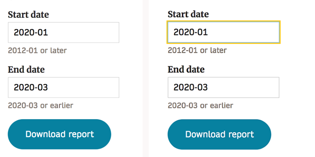
In SNAP we use two month fields to let librarians choose a date range:
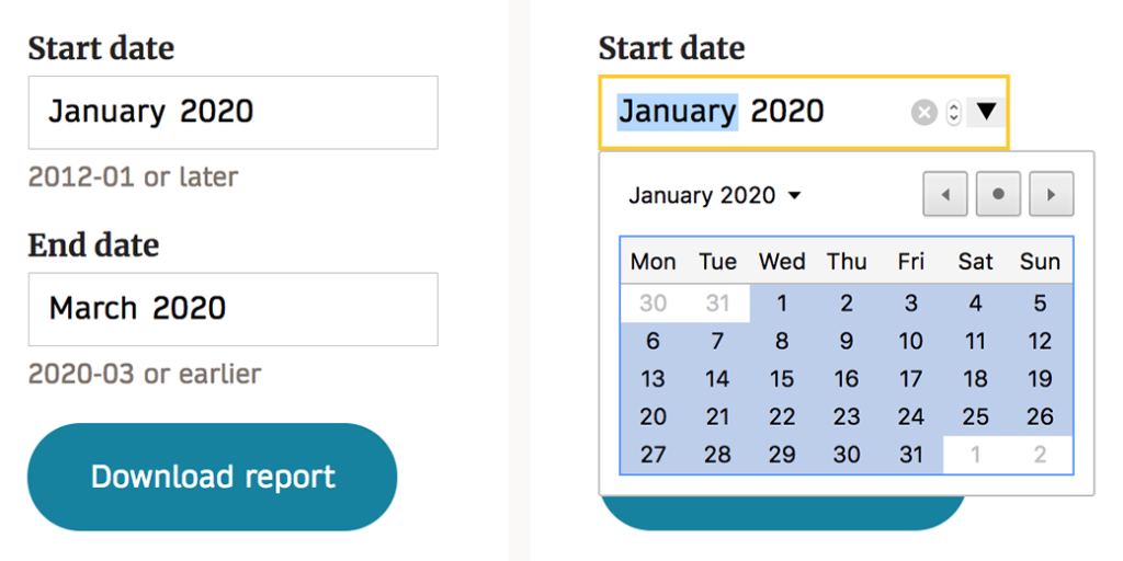
This solution is great for us – we just tell the browser that we want the user to choose a specific month, and the browser does the rest. Unfortunately only Chrome shows a calendar to select from. In other browsers librarians need to write the month in text:
And, the calendar Chrome uses is really confusing to librarians. Actually I suspect that it’s confusing to everyone…
An experience goal for SNAP is that low effort is needed to use it. This date picker is not helping librarians be efficient. We need a different solution.
Let’s do some human-centered design to solve the problems!
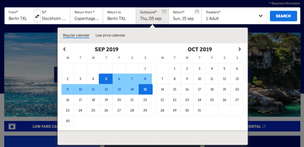
We created a little crew with me, two developers and a designer colleague. We started off by looking at how others let people select date ranges and found good examples:
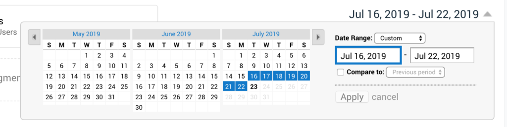
We got together, ideated wildly and came up with more than ten ways of selecting a range of dates. The ideas fell into a few themes and we spoke about those themes to understand complexity, accessibility, usability, etc of each. In the end we believed that the GOV.UK solution is the best – it’s clear, simple to implement and instantly accessible.
We liked a bonus idea as well: having “quick links” for common date ranges like “year to date”, “last year”, etc. When clicking on the “link” the data fields will be automatically filled in.
Validate the prototype with librarians
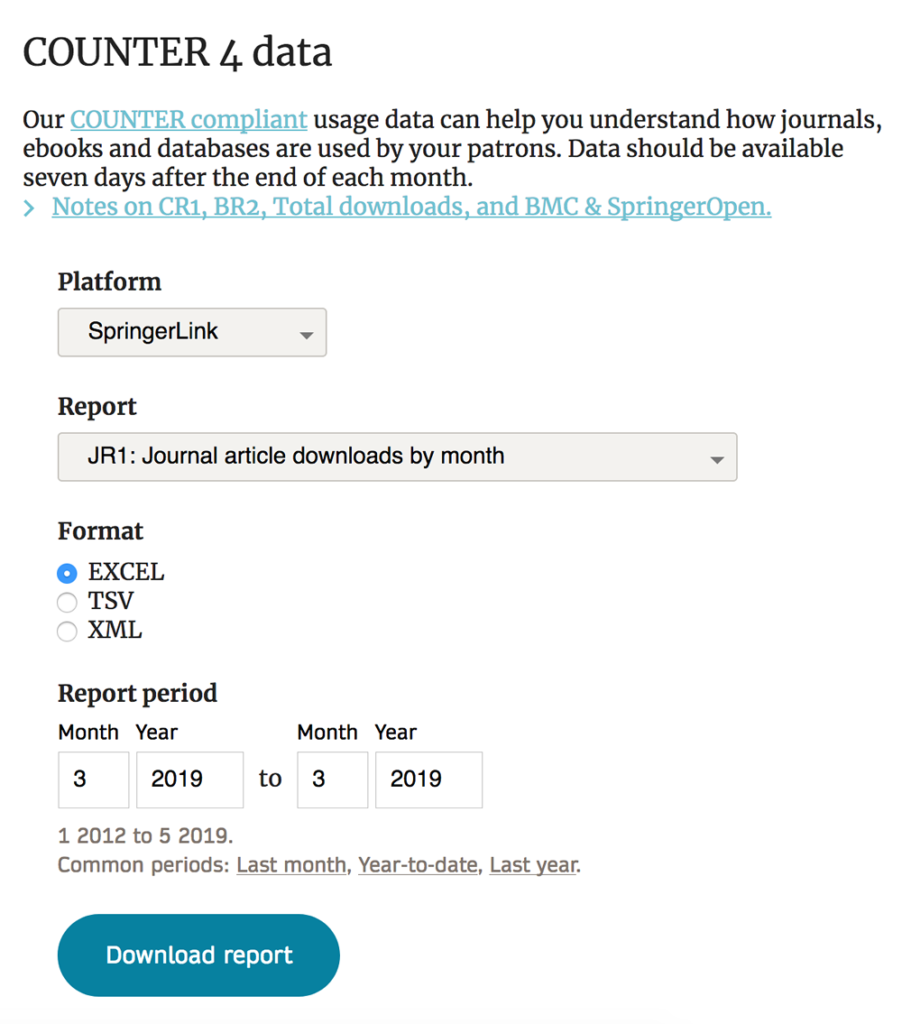
I created a prototype for the new date range selector, showing how it would work in the COUNTER usage data download form:
I then used two methods to test if librarians understand the new design:
- Video calls where librarians shared their screen and walked me through how they would use the form.
- Emails where the librarian was asked to tell me in writing what they would put in each field in the form. I’d never done a usability test via email before, but for this specific interface it worked great – the responses I got back were very clear.
The usability tests showed that the new data range design works well. Librarians understand what to put in each field. One area was confusing though: the definition of the “quick link” words. “Year to date” means different things to different people. But the functionality of the links was appreciated by librarians. I will need to rethink the words!
Next steps
The next steps are to iterate on the words for the quick links and then to go from prototype to real code so we can get all librarians to use the new date range chooser. Based on their feedback we will see if it is as good as I believe it is.
It might not be the best solution in the Universe, but I truly believe that this new way to select a date range will make librarians more efficient.