All adults know that dragons giggle when they are tickled. But many kids have not found that out yet. So we in the Bolibompa team set out to build a digital Dragon who kids relate to and whom they want to tickle!
The Bolibompa.se site was the SVT web site for 3–5 year olds. The site has now been replaced by native apps. Bolibompa is also a TV show that feature a live action Dragon. The site had three overarching goals:
- To be a great video player that only included programs for our youngest viewers
- To help kids build a relationship with the Dragon
- To help parents in their everyday lives
A Ticklish Mission
A morning in 2014 the Bolibompa concept developer Erik N gave me the brief for a new part of the site. As a first attempt at helping kids build a relationship with the Dragon we should enable kids to tickle the Dragon on it’s belly, thus making it giggle.
Step 0: A plan
I started out thinking about an elaborate multi step plan for the project but my colleague Rickard W gave me inspiration for a lighter, better path – the eight steps below.
Step 1: Discussion about Prerequisites and Context
I invited the development team and the production team for the TV show to a group discussion about the factors that frame this small project.
A diverse group assembled for a 90 minute talk – developers, designer, TV show producer, the head of the TV channel etc. My first goal was to get everybody thinking and to get a much more diverse range of topics to discuss then I alone could have imagined. I simply asked my colleagues to jot down, on big post-its, questions they have about the project. To frame the discussion slightly and give examples of what kind of questions I was after I gave a few questions and answered them at once. For example “What kind of interactivity and how many interactions should there be?” was answered “For now, just one interaction: Tickle the Dragon and it will Laugh.”.
The group jotted down 50+ questions about the concept, tech, integration with the TV program etc. During a short break I grouped the questions and took away any that would be better answered in future steps. We where left with about 20 questions and the group got to vote for which questions where most valuable to answer right now. Then we simply read each question and the person in the room who had an answer to it would tell the group. For example “Which attributes of the live action TV show Dragon do we need to incorporate into the interactive Dragon” was answered mostly by the project manager for the TV show but of course with follow-up questions and discussion among other participants.
Step 3: Design Studio
Our design studio was based on the method used in architectural education, but much quicker. I brought the prerequisites from the previous discussion and lots of pens and papers. We did 3 iterations of ideation – by ourselves, in pairs and in teams of five – and created lots of interesting ideas. The final concepts where quite distinct and both included ideas that I had never been able to come up with on my own. I love Design Studios!
Step 4: 2 prototypes
I built prototypes of the two concepts. I call them “The Trap door” and “My neighbour the Dragon” and you can check them out: Trap door, Neighbour. They are best on a portrait iPad. To get the Dragon to appear, start the video and then pause it. The simple animations are made in Adobe Edge Animate and the video is embedded via YouTube’s Javascript API.
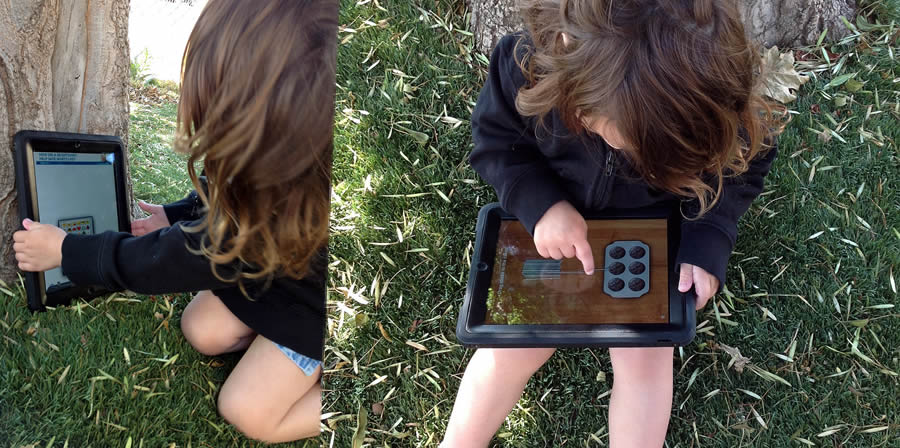
Step 5: Tests with kids
We had the great honor of hanging with a bunch of kids. We let them play with the prototypes to figure out if one of them was better. We looked at whether the kids realized how to get back from the Dragon to the video, if the waving arms where needed to get them to tap the Dragons belly and generally if they where happy that the Dragon responded to their “tickling”. We found that both prototypes fared about equally well, and that they where quite appreciated by the kids. But the arms did not need to wave. Since there was a tie between the versions we included ideas about our future roadmap for the site into the calculations and decided to refine “the neighbor”.
Step 6: 1 prototype
I hacked away at the prototype and you can check out the results.
Step 7: More tests
We met more kids and had them play with the single prototype. The results where still not overwhelmingly positive. Many kids clicked the belly, but some did not. We also reasoned more regarding staying in the scene (as the trap door version does) versus having the stage disappear and came to the new conclusion that staying in the scene is better.
Step 8: Delivery prototype
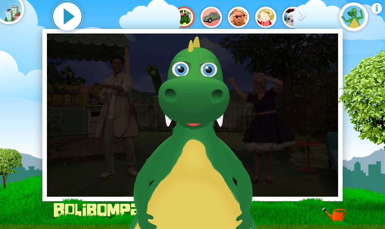
I built a new prototype which contain the essence of our research results:
- The Dragon appear and disappear vertically.
- When it is visible it takes up a lot of space on the stage.
- There is a small amount of face movement to make the Dragon feel alive, the eyes are important.
- The belly has two or possibly three distinct transformations or other attention grabbing animations that encourage the kid to click the belly. These do preferably not include that the Dragon “point at” its belly or such simple and uncreative attention grabbers. Which they are can preferably be experimented with and evaluated with A/B Tests.
The result
I left the team shortly after delivering the last prototype. As the team was part of the two workshops and both test sessions I felt very comfortable leaving them with the last prototype and their own deep understanding of the project. They built the Dragon and included it on the Bolibompa web site which has since transitioned into a native app.