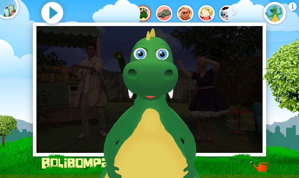
I have created a system where content types are represented with a shape and an integrated preview of the content.
Often there is a mix of content types in one content repository. For example on Buzzfeed.com we are presented with link units (picture + heading + preamble etc) to a mix of quizzes, videos, lists and other types on content. We designers often want to help readers understand what kind of content the link leads to and therefore use a variety of ways of representing the (main) content type of the link target.
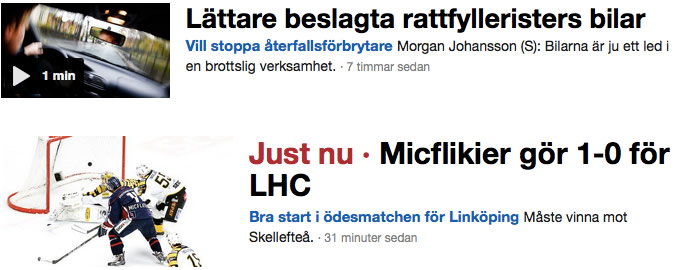
SVT Nyheter (News from the Swedish Public Television) use two visual representations for their content. The first one is to display video links with a 16:9 freeze frame and a Play arrow in the lower corner. The other is a set of terms, displayed singularly in red as part of the heading of an article link. The words include “Just nu” for developing stories and “Live” for live video broadcasts.
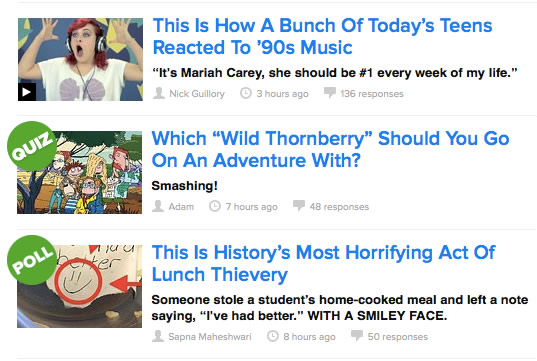
Buzzfeed use a larger variety of symbols to represent content types. Like SVT they use a still frame with an arrow on to represent video. They also use a circle with “Quiz” and “Poll” in. They use the same circle+text, but in different colours, to highlight trending posts etc.
While working at Barnkanalen I realized that we can create a system of visually distinct representations – a system that use content and shape to help persons understand what the link will lead to.
My system contains:
- Persons and characters are represented with their face in a circle like in so many places on the web and in apps.
- Specific, confined functionality such as games and quizzes are represented with a logo in a square with rounded corners like an app icon on iOS.
- Photos are represented with a wide white border, similar to a Polaroid pic. To make photos most easily distinguished, keep them in one format (square, portrait or landscape).
- Videos are represented by a 16:9 freeze frame and an arrow. Using 16:9 has been shown in usability tests to be important to represent that the link leads to video rather then to a photo. Using a somewhat grimy freeze frame rather then a promo photo has also been shown to increase the understanding that the link leads to video rather then just a photo.
I like this system because the shapes are distinct and because it has been shown in test sessions that they are easily understandable even by kids. While the shape represent that the items are of the same type, the content is integrated while also being unique to this instance of the content type.
What do you think? Is the system valuable? What other shapes can we find to represent content types?